Trends
Trends show how your symptoms change over time—are things getting better, worse, or staying steady?
How to Use Trends
- Go to Insights → Trends
- Select a symptom type (Bloating, Nausea, etc.)
- View the weekly charts for frequency and severity
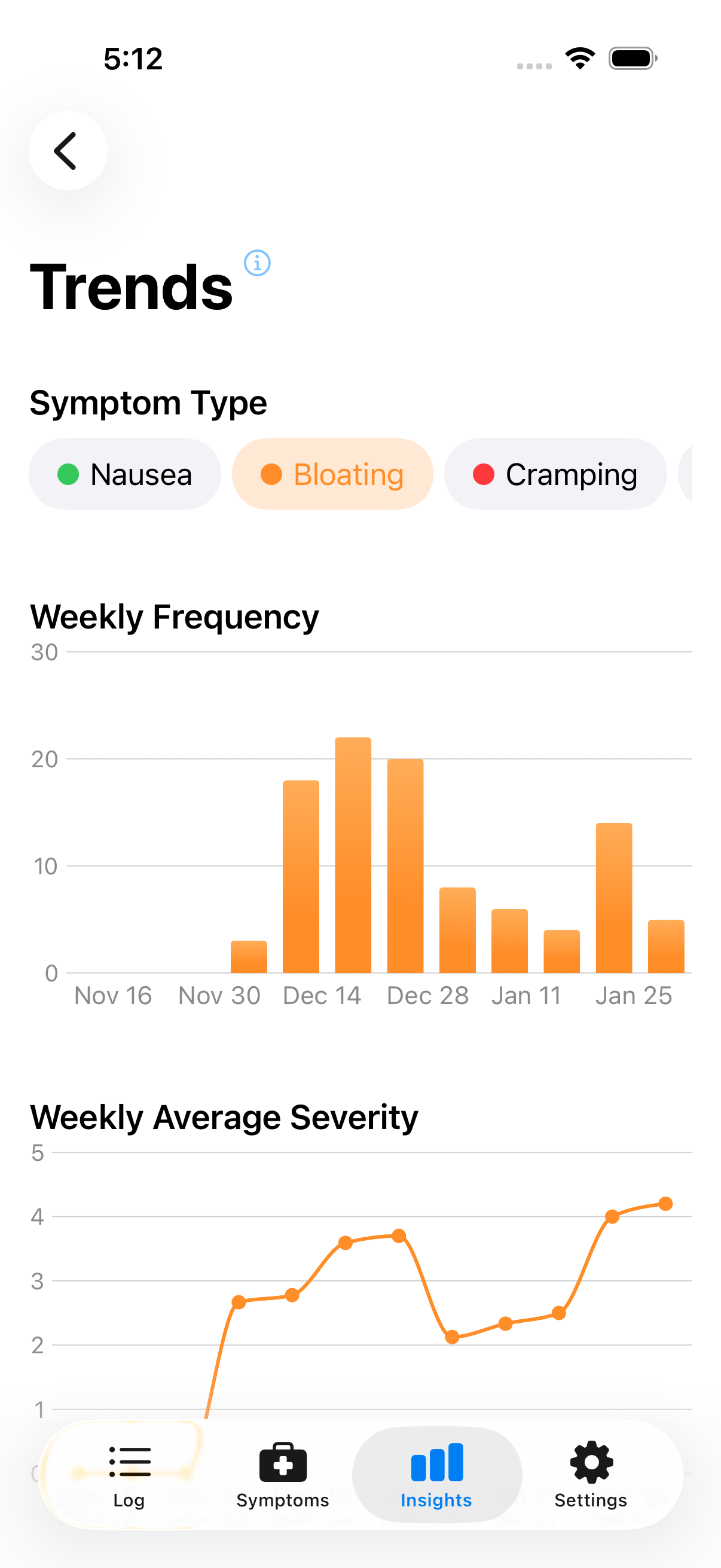
Select a symptom type to view its trends
Reading the Charts
Frequency: Higher bars mean more symptom events that week. Look for patterns—increasing, decreasing, or steady?
Severity: Higher bars mean more severe symptoms on average (scale 1–5 based on your ratings).
Time Range
Trends show the last 4–12 weeks depending on your data. More logging means more context.
Using Trends Effectively
Track changes: Trying something new? Trends show whether eliminating a food or adding a supplement makes a difference over weeks.
Spot problem periods: A spike might prompt you to investigate what was different—travel, stress, dietary changes.
Prepare for appointments: Showing your doctor a trend chart beats saying "I think it's getting worse."
Keep in Mind
Trends show what happened, not why. A decreasing trend could mean your dietary changes are working—or that stress went down, or random variation. Use trends alongside correlations for a fuller picture.
Next: Learn about Spikes & Highlights.